Selecting the perfect interior paint color is a crucial aspect of home design. Not only does it set the foundation for your entire aesthetic, but it also has a significant impact on the mood and atmosphere within each room.
In this blog post, we will delve into the psychology behind colors, explore various color options from neutral to bold and vibrant hues, and share expert tips to help you choose the best interior paint color that seamlessly complements your living space.
We will offer practical advice by discussing various color groups – ranging from neutral tones such as Sherwin-Williams Agreeable Gray and Alabaster recommended by realtors for boosting property values in 2022 to vibrant hues ideal for adding personality; and pastel shades known for evoking tranquility within living spaces.
Importance Of Interior Paint Color In Home Design
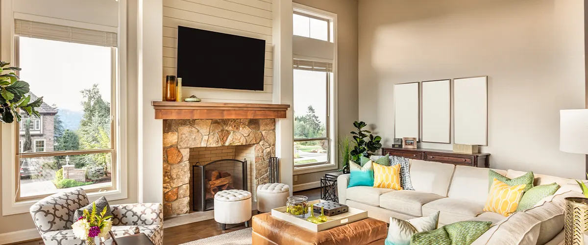
The significance of interior paint color in home design cannot be overstated. Interior paint color plays a crucial role in setting the mood and atmosphere, as well as providing a cohesive backdrop for your furniture and personal style preferences.
No room is complete without its walls bearing a coat of carefully selected paint. The right shade adds depth, warmth, and personality to any space it inhabits, allowing you to create an environment that reflects your unique taste and lifestyle.
In addition to aesthetic benefits, thoughtfully chosen interior paint colors have been proven to affect our emotional well-being positively. For example, certain shades inspire feelings of calmness or happiness while others promote creativity or relaxation.
Understanding The Psychology Of Colors
Choosing the right interior paint color for your home can seem daunting, but a basic understanding of color psychology can simplify the process. Colors have the power to impact our moods and emotions, which makes them essential elements in creating a comfortable and inviting living space.
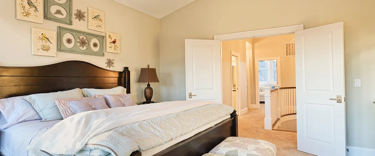
When selecting colors for specific rooms in your home, consider their function. For example, muted blues or greens are perfect choices for bedrooms since they promote relaxation while vibrant shades of yellow or orange work well in areas associated with socialization such as kitchens or dining spaces.
It’s important to note that personal preferences play an important factor when choosing paint colors regardless of their psychological effects on mood.
Colors Can Affect Mood And Atmosphere
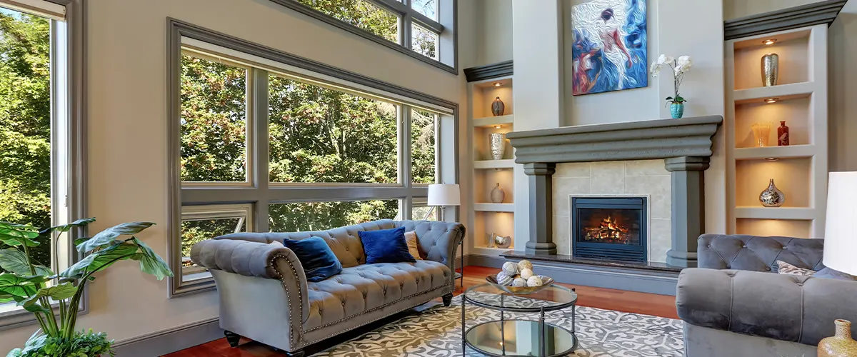
The colors we choose for our home interiors can have a profound impact on our mood and emotions. Warm colors like reds, oranges, and yellows tend to promote feelings of energy and excitement, while cooler tones such as blues and greens are often associated with calmness and relaxation.
It’s essential to consider the purpose of each room when choosing your paint color scheme. For example, bedrooms should be peaceful sanctuaries that promote restful sleep.
Soothing colors like pastels or muted hues work best in these spaces.
When painting a house for resale value, neutral hues are generally favored by real estate professionals because they appeal to a broad range of potential buyers’ tastes.
Overall, it’s important to remember that subtle differences in hue can significantly affect the overall feeling of a space—so take the time to select carefully!
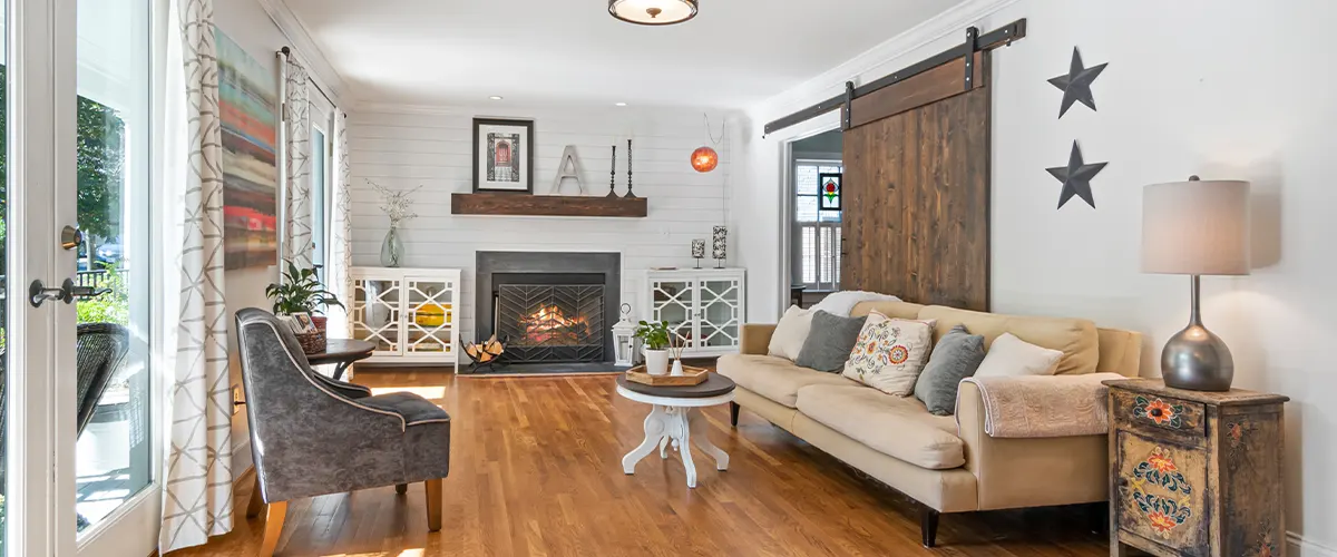
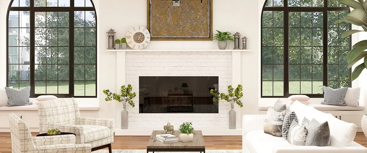
Neutral Colors: Versatility And Timelessness
Neutral colors remain a popular choice for home interiors among homeowners, designers, and realtors because of their versatility and timelessness. They are easy on the eyes, create an inviting atmosphere, and allow individuals to add pops of color through accessories or furniture pieces.
Examples of popular neutral colors include Beige, Gray, White, and Taupe. Beige is a warm neutral that pairs well with earthy tones while Gray adds sophistication and modernity.
Using neutral colors in your home interior offers various benefits like flexibility in styling options regardless of trends or seasons. It also creates continuity throughout the entire house by using similar paint colors across different rooms leading to visual harmony.
One crucial tip when selecting neutral paint colors is considering undertones since these hues have varying shades from cool (blue-based) to warm (yellow/orange-based).
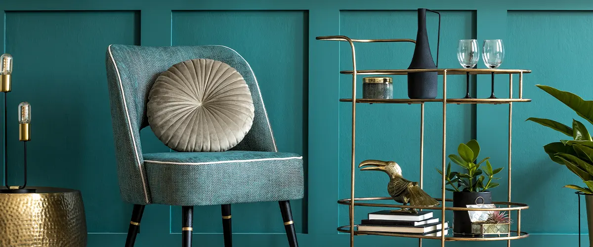
Bold And Vibrant Colors: Adding Personality And Impact
Bold and vibrant colors can add personality and impact to your home interior design. When used correctly, they bring life to a room, making it feel energized and welcoming.
Consider using bright hues as accents or in small spaces such as powder rooms or entryways.
One essential tip when incorporating bolder colors is choosing options that complement existing furniture pieces and decor elements. A rich red rug or orange throw pillows can perk up a boring white sofa while maintaining balance within the space.
Remember that bold colors don’t always mean wild patterns or neon shades; think about sophisticated jewel tones like emerald green, sapphire blue, and rich purples.
Pastel And Soft Tones: Creating Serenity And Tranquility
Pastel and soft tones are perfect for creating a peaceful and calming atmosphere in your home. These hues, such as pale blues, greens, lavenders, and pinks, evoke a sense of serenity that can help you relax after a long day at work.
For instance, sage green is an ideal color for bedrooms because it exudes tranquility. Lemon yellow adds warmth to the kitchen area while light blue creates calmness in living spaces like the family room or den.
Moreover, pastels work well with other colors too! A combination of pale-blue walls topped with white crown molding provides visual interest without being overwhelming.
Exploring Alternative Paint Finishes For Different Effects
In addition to considering different colors, homeowners can also explore alternative paint finishes for a variety of effects. Matte or flat finish paint is a popular choice for walls as it creates a smooth surface without any shine.
Eggshell and satin finishes provide a slight gloss and are great for surfaces that need more durability, like trim or doors.
Another option to consider is chalkboard paint which allows homeowners to turn an entire wall into a writable surface perfect for notes and lists. Additionally, textured paints such as Venetian plaster or stucco offer unique visual interest while creating the illusion of depth and dimensionality.
According to recent trends, shiny lacquered surfaces have become increasingly popular in modern interiors. High-gloss painted furniture pieces offer bold contrast against matte walls while also adding an element of glamour to any room.
Alternatively, distressed painting techniques create vintage charm through layers of chipped color on wooden furniture or cabinets.
Conclusion
In conclusion, choosing the best interior paint color for your home can be a daunting task, but with these tips and guidelines, it doesn’t have to be. Remember that understanding the psychology of colors is key in creating the right atmosphere for each room.
Neutral colors like Behr White 52 are always a safe bet for their versatility and timeless appeal. However, don’t shy away from bold and vibrant colors or pastel tones if they suit your style and purpose.
Ultimately, let your creativity guide you as you explore different paint finishes and combinations. And if you need a professional opinion, we’re here for you! Reach out to us for anything interior-painting related and we’ll help you out!